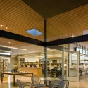
The Commons / debartolo architects
The leadership of a large local church in Arizona challenged DeBartolo Architects to design a building that would be strategically located in the new core of the campus and serve as the social center for all activities. As the first building of a new masterplan, the commons has transformed the campus, by becoming an inside-out building that literally opens on all sides.


This unique structure was birthed as a “pavilion” based on the challenge to enter the building effortlessly, where users are literally within the building without the customary sense of “entrance”. The interior spaces totaling 8,000 sf are composed of a bookstore, coffee shop, fellowship space and support spaces. The exterior shaded space is over 10,000 sf and can accommodate another 150 people at tables.
Oriented at the 45° angle of the other campus buildings, the 60′ long northwest wall of glass vertical-lift doors open to the future worship center and plaza, where there will be a closely related sense of entry between the commons and worship center entrance. This plaza will be filled with large native desert trees and will provide a shaded connection between the two new structures.
Once within the conditioned space of the commons there are three major spaces. The fellowship space with its ground concrete floors and a perforated wood (acoustical) ceiling is the major social space on campus where temperate climate will alter the use of the space permitting it to be opened or closed. This space can accommodate up to 200 people, but with the unique geometry and transparency, achieves intimacy with even small groups. The space provides 18 wood-top tables with 72 chairs; in addition six bar-height tables along the side near the coffee counter with another 18 chairs. Computer stations are docked against the southeast wall near the bookstore.
The second area is the café with its 40′ long ‘counter’ that is distinctively designed to accommodate the surge of traffic that will be served before and after services, permitting the staff to spread out the users and serve multiple people efficiently. The innovative use of inexpensive custom printed signage will be employed to inform people of items for sale or specials, and are easily change permitting the character of the café to be altered meeting the changing needs.
The third element is the bookstore, a more intimate space dedicated to Christian education and books. This space currently accommodates approximately 5,000 books and has the potential for more than 10,000. The entries open into a common space where tables will display the most commonly requested items and soft goods, with a 4-station counter for support and purchasing. Behind the counter, the flooring changes to carpet, the ceiling drops to quiet the space and there are chairs for reading and tables for more display. The unique bookshelves are more like ‘book boxes’ - integrated with window boxes - where titles are organized within the composition of movement, light and texture.
The remaining element is the service core, made up of indoor-outdoor accessible restrooms, storage, and the new campus central server room; all elements critical to the growing campus. 


 floor plan
 section
Photographs: Bill Timmerman
SOURCE


0 comments:
Post a Comment